Museum Website Redesign
UX Design | Team Project | Spring 2024
Our client, the Pittsburgh Children’s Museum, wanted a fresh redesign of their website. Weeks of drafting led to the final redesign for the Children’s Museum (left) and Museum Lab (right).

My Contributions:
Constructed wireframes in Figma.
Illustrated smaller graphical elements.
Researched user and clients’ needs.
The WIREFRAMES
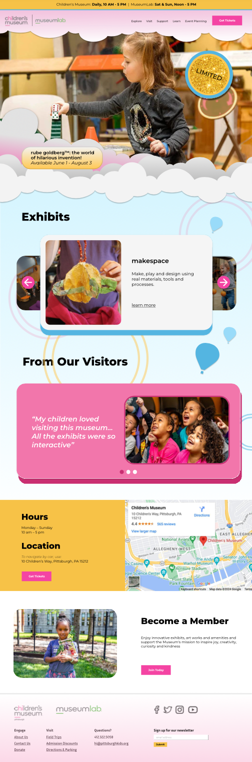
include get tickets button to encourage sales and easy access.
Different Color Schemes for Different Audiences.
Create Fun Graphic Elements to mimic museum’s theme.
Highlight services through can’t-miss features.

The Process
Research First
The Pittsburgh Children’s Museum wanted fresh ideas. The best way to start, our team decided, was to find the weak points of the website as a user.
We first looked at the possible archetypes using the website: planning parents, curious kids, etc. Looking through the lens of this archetype, we determined the main points of interests the website needed to cover.


Organizing Site-Maps
The next steps included mapping out the pages and information. Where would you find museum ticket prices? Would you include it on the home page or separate it?
Our team designed site-maps to better organize the website. Each column represented the information that would fit the needs each archetype would immediately search for.


Wireframing
Following our planning, the team worked on wireframes. For the redesign, we had a goal: bring in more visitors to the museum. With this in mind, we had to think about where to include images, buttons, testimonies. How could we maximize retention and draw in customers to buy tickets?
Wireframing with this goal helped to guide the process. We decided to make the first thing the user see was an image slideshow utilizing the whole space. We wanted to immerse the user in the exhibit, building intrigue over the museum.